Case Study
Unlocking $288K in Potential Revenue
Executive Summary
- Current bounce rate: 57% (17% above industry average)
- Identified annual revenue opportunity: $288,000
- Monthly visitors: 10,000
- Projected conversion improvement: 2%
- UX/UI redesign proposal
- Data-driven improvement strategies
As a UX designer, I'm always fascinated by the stories data tells us. When I came across Logical Property Management's website, the numbers were practically jumping off the screen, waving red flags. With 10,000 monthly visitors and a 57% bounce rate (compared to the industry average of 40%), this website was essentially showing potential customers the door before they could even take their shoes off.
The cost of poor user experience is significant. With their current bounce rate sitting 17% higher than the industry average, Logical Property Management is potentially missing out on approximately $288,000 in annual revenue. That's not just a number I pulled out of thin air—it's based on their average property management fee of 10% on Detroit's average rental rate of $1,200. By simply bringing their bounce rate down to industry standards, they could be converting an additional 200 customers per month. In the property management world, that's like leaving an entire apartment complex worth of commission on the table each year.
A Tale of First Impressions

Like putting your filing cabinet in your store window

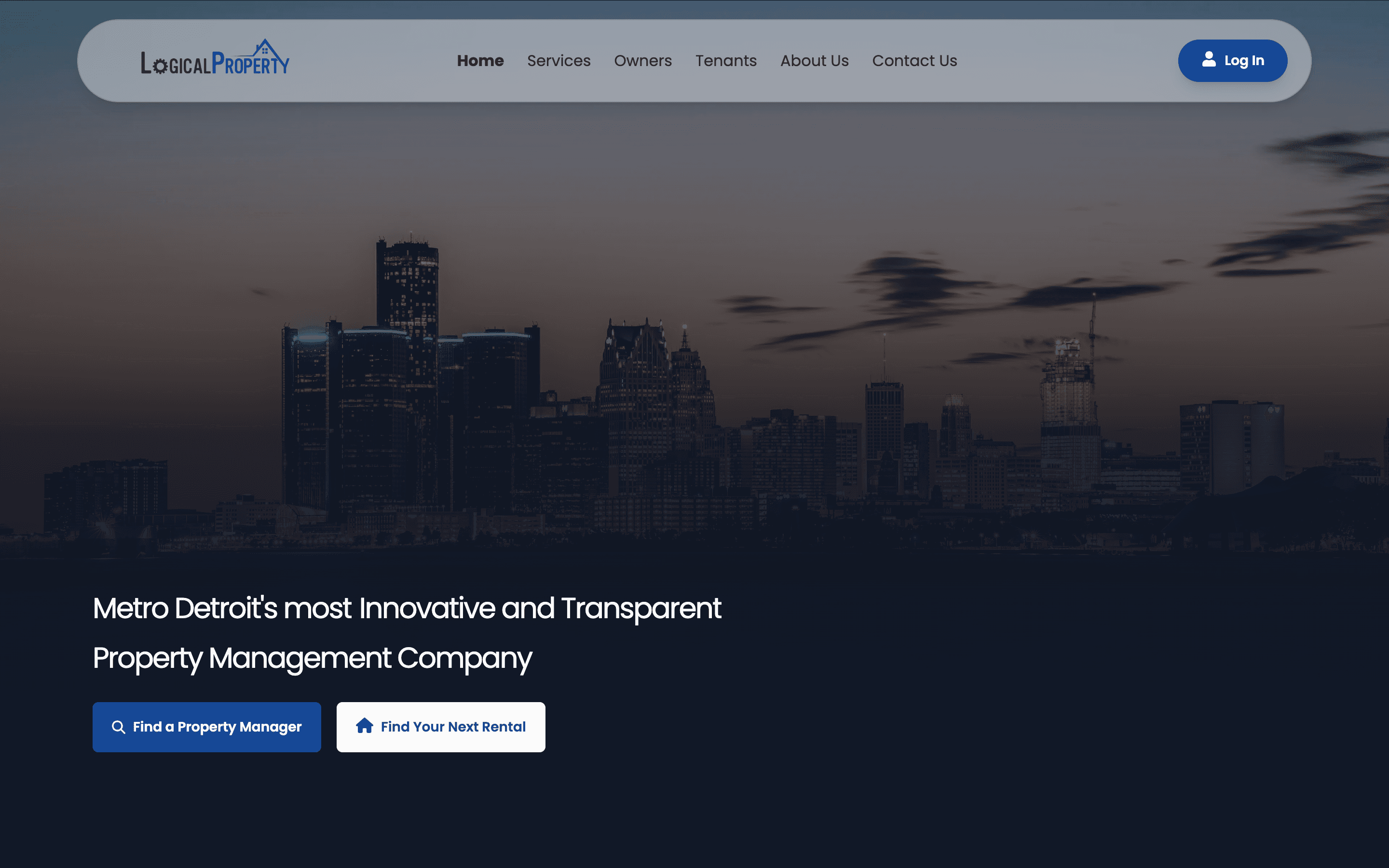
A view worth stopping for
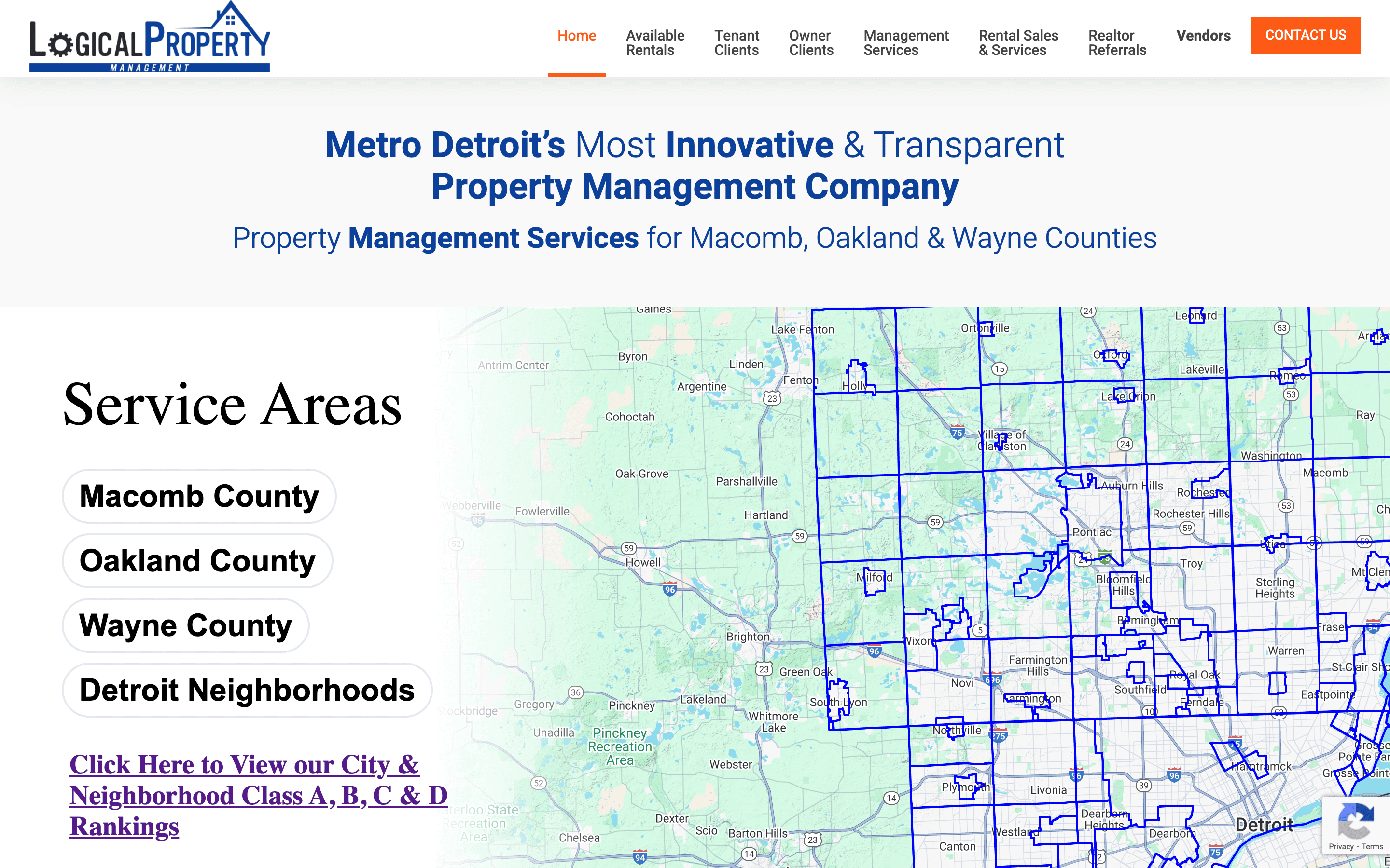
The original design had all the elements of a good website... somewhere in there. Like a messy garage sale where valuable antiques are buried under old newspapers, valuable information was hidden beneath layers of complexity. The hero section, featuring a large geographic map and generic claims of being "Most Innovative & Transparent," was about as engaging as a real estate textbook. It's like opening a restaurant and putting your health inspection certificate in the window instead of your most appetizing dishes.
The Circular Logic of Poor Design

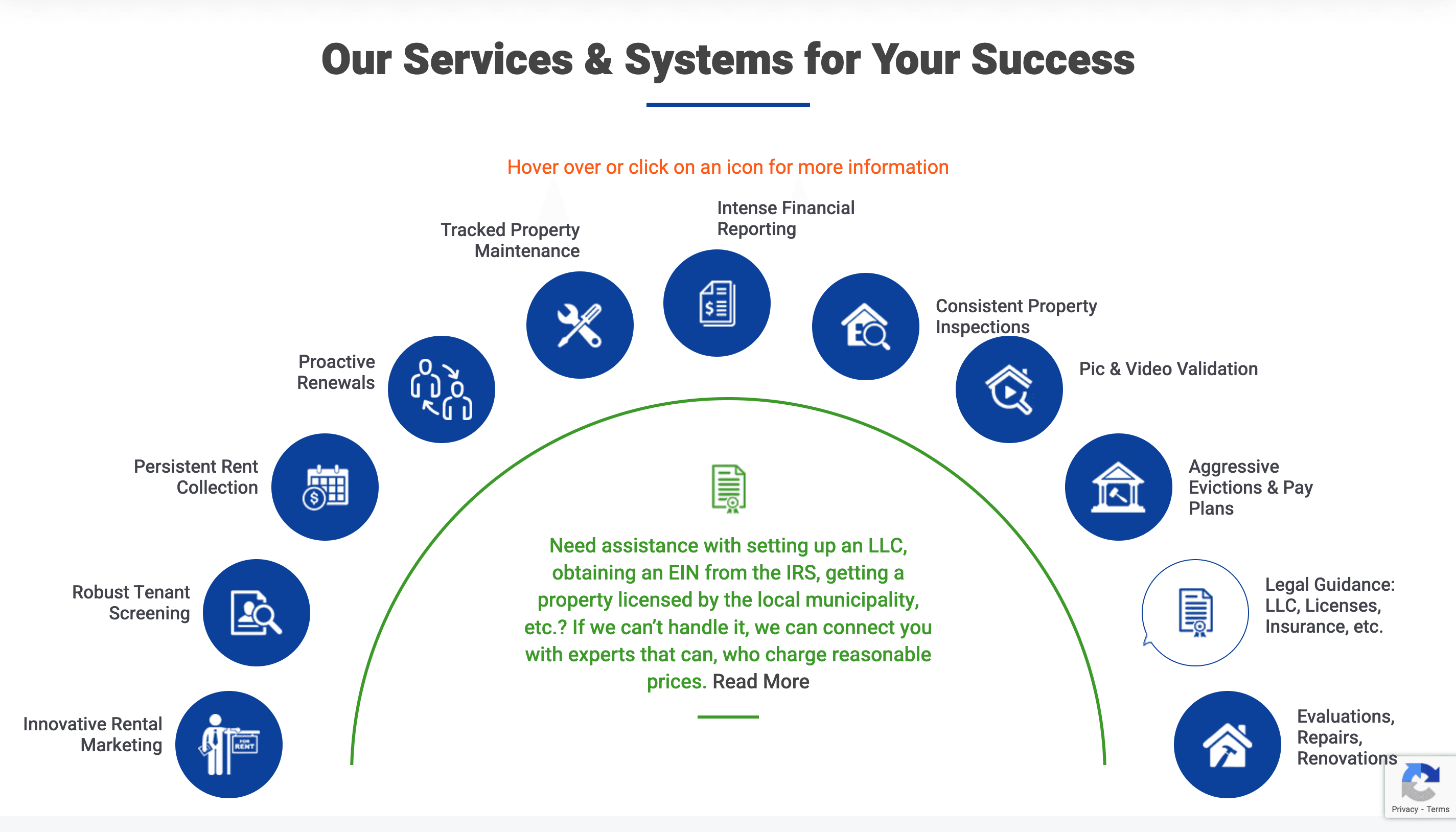
Perhaps the most puzzling element was their services display—a circular menu requiring users to hover or click for more information. While visually interesting, it was about as practical as a revolving door in a submarine. Users had to work harder than a detective solving a mystery just to understand basic services. In the digital world, making users work hard is like putting your store at the top of a mountain—sure, some dedicated folks will make the climb, but most will find an easier path.
A Tale of Two Audiences


The redesign acknowledges a fundamental truth about property management websites: they serve two distinct audiences with different needs. Property owners looking for management services and potential tenants searching for homes are like cats and dogs—they might live in the same house, but they need very different kinds of care. The new design creates clear pathways for both, eliminating the "which way do I go?" confusion of the original site.
From Information Overload to Guided Journey


The original site's approach to legal information and service details was like trying to drink from a fire hose—overwhelming and not very effective. The new design treats this content like a good butler—keeping it readily available but not interrupting the main conversation. By moving detailed service information into an organized FAQ section, we've created a more digestible experience that doesn't sacrifice thoroughness for clarity.
The Bottom Line
With an industry-standard bounce rate of 40% seemingly within reach through these design improvements, the potential return on investment is clear. A well-designed website isn't just about looking pretty—it's about converting visitors into clients. In this case, that could mean an additional $288,000 in annual revenue, making this redesign less of an expense and more of an investment in future growth.
Explore the Websites
See for yourself how the redesign enhances user experience and potential revenue.
